#HereWeAre
Here we are: In the ever-changing times, Breakthrough remains rooted in Hong Kong, moving forward with unwavering faith, in step with our next generation.
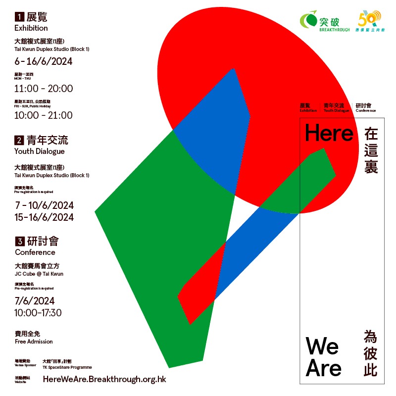
The use of the primary colours and geometric shapes of light, red, blue, and green, serves the following purposes:
l Symbolizing the uniqueness of each young person’s life
l Reflecting their potentials to illuminate the community
l Sparking new imaginations and possibilities.